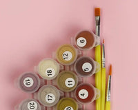
Color theory combines the science and art of color manipulation. It explains human color perception and provides principles for mixing, matching, and contrasting colors visually. It also addresses communicating information through color and techniques for accurate color reproduction.
Color is vital to visual perception, affecting our emotions, behaviors, and decisions. From the brilliance of a sunset to the shades of a grayscale photo, color influences many aspects of our daily lives.
An in-depth comprehension of color categorization is essential for numerous industries, including graphic design, fashion, and interior design. In these fields, the application of color theory is paramount for crafting designs that are both visually compelling and impactful.
Have you considered how colors are systematically classified? Understanding these principles can greatly enhance our appreciation of the vibrant spectrum surrounding us.Color Basics
Understanding color theory is critical in design and visual communication. Mastery of basic color principles creates visually engaging and impactful designs.
The primary colors, red, blue, and yellow, are essential hues that can't be made by mixing other colors. Combining two primary colors creates secondary colors like orange, green, and purple. Tertiary colors emerge from blending primary and secondary colors.
Color schemes are carefully curated combinations of harmonious colors chosen for a cohesive aesthetic. Common schemes include complementary colors (opposite on the color wheel), analogous colors (next to each other), and monochromatic colors (various shades, tones, and tints of a single hue).

Colors By Color Category
Colors can be divided into several categories based on their properties and visual impact. Here is a detailed study of colors divided by primary color category:Primary Colors
Primary colors are the building blocks of all other colors. They are unique in that they cannot be created by mixing other colors. Different color systems have slightly different primary colors.Additive Primary Colors (RGB)
- Red: An intense, warm color associated with energy, passion, and excitement. It is often used to attract attention.
- Green: Represents nature, growth, and tranquility. It is used to convey calmness and balance.
- Blue: Symbolizes trust, loyalty, and calm. It is often used in corporate designs to instill a sense of professionalism.

- Cyan: A green-blue color used in printing. It is associated with freshness and water.
- Magenta: A purple-red color often associated with creativity and innovation.
- Yellow: A bright, cheerful color that evokes happiness and optimism.
Secondary Colors
Secondary colors are created by mixing two primary colors. They are the next step in color complexity.Additive Secondary Colors (RGB)
- Yellow (Red + Green): Looks vibrant. It is associated with sunshine and happiness.
- Cyan (Green + Blue): Represents water, sky, and coolness.
- Magenta (Red + Blue): Often associated with creativity and spirituality.
- Red (Magenta + Yellow): An intense color associated with love, passion, and urgency.
- Green (Cyan + Yellow): Evokes nature, growth, and harmony.
- Blue (Cyan + Magenta): Conveys trust, depth, and stability.
Tertiary Colors
Tertiary colors are made by mixing a primary color with a secondary color. They offer more subtle hues and are often used in design and art for their richness and variety.- Red-Orange: Combines the energy of red with the warmth of orange.
- Yellow-Orange: Combines the cheerfulness of yellow with the warmth of orange.
- Yellow-Green: Combines the brightness of yellow with the calmness of green.
- Blue-Green: Combines the tranquility of blue with the freshness of green.
- Blue-Purple: Blends the depth of blue with the creativity of purple.
- Red-Purple: Blends the passion of red with the spirituality of purple.
Warm Colors
Warm colors evoke warmth and comfort, reminiscent of sunshine and fire. They are often more energetic and stimulating.
- Red: Bold and intense, often associated with passion and urgency.
- Orange: A combination of red and yellow, it symbolizes energy, enthusiasm, and warmth.
- Yellow: Bright and cheerful, often associated with happiness and optimism.

Cool Colors
Cool colors are calming and soothing, reminiscent of water and sky. They often create a sense of tranquility and relaxation.- Blue: Known for its calming effects, it symbolizes trust and stability.
- Green: Represents nature, growth, and renewal, and evokes a sense of tranquility and balance.
- Purple: A blend of blue and red, it is associated with luxury, creativity, and spirituality.
Neutral Colors
Neutral colors are versatile and can be paired with almost any other color. They are often used as a background or to complement brighter tones.- White: Represents purity, cleanliness, and simplicity.
- Black: Symbolizes sophistication, elegance, and formality.
- Gray: A balancing color that evokes a sense of calm and neutrality.
- Brown: Associated with earthiness, reliability, and stability.
- Beige: A light, neutral color that conveys calm and simplicity.
Pastel Colors
Pastel colors are soft, light tones. They are often used to create a calm and soothing atmosphere and are popular in design and fashion.
- Pastel Pink: A soft, gentle color associated with femininity and romance.
- Pastel Blue: A light, airy color that conveys calm and serenity.
- Pastel Green: Represents freshness and tranquility in a subtle, soft hue.
- Pastel Yellow: A light, cheerful color that evokes happiness and optimism.
- Mauve: A gentle, soothing color associated with creativity and imagination.
Earth Tones
Earth tones are muted colors inspired by natural elements such as soil, rocks, and vegetation. They create a warm, grounded atmosphere.- Terracotta: A warm reddish brown that is reminiscent of clay.
- Olive: A soft green that conveys a sense of earthiness and stability.
- Rust: A deep reddish brown that is associated with natural decay and aging.
- Mustard: A deep yellow-brown that evokes warmth and abundance.
Jewel Tones
Jewel tones are rich, vibrant colors inspired by gemstones. They are often used to convey luxury and sophistication.- Emerald: A deep green that symbolizes wealth and abundance.
- Ruby: A vibrant, deep red that is associated with passion and luxury.
- Sapphire: A rich, deep blue that conveys trust and depth.
- Amethyst: A luxurious, deep purple that is associated with creativity and royalty.
Metallics
Metallics mimic the look of metal and are often used to convey a sense of luxury and sophistication.
- Gold: A shiny yellow color associated with wealth and prestige.
- Silver: A sleek, cool color that conveys modernity and elegance.
- Bronze: A warm brown color associated with tradition and durability.
- Copper: A reddish-brown metallic color that evokes warmth and richness.
Practical Tips for Color Mixing in Paint By Numbers
With your foundational knowledge of color theory firmly in place, it is time to explore advanced blending techniques. These methods serve as sophisticated tools for crafting exquisite gradients and captivating effects within your artistic creations.
1. Explore Wet-on-Wet Blending
Wet-on-wet painting is an intriguing technique that permits colors to seamlessly merge directly on the canvas. This method imparts a soft and natural aesthetic to your artwork.
2. Create Depth Through Layering
Enhance your artwork's complexity and richness through layering. Start with a base color and let it dry. Add more layers to introduce shadows, highlights, and details, significantly enhancing your composition's vividness. Using paint by numbers techniques for layering can turn a basic canvas into a masterpiece.
3. Add Details Using the Dry Brush Technique
The dry brush technique is highly effective for incorporating texture and intricate details into paint by numbers. This method enhances depth and precision, thereby enriching the overall quality of the artwork.

How Do We Perceive Different Hues?
We perceive different hues through our eyes, specifically the cones in our retina. Cones are responsible for detecting color and are sensitive to different wavelengths of light.
When light enters our eyes and hits these cells, it is converted into electrical signals and sent to the brain for processing. The brain then interprets these signals as different colors, allowing us to perceive the various hues that make up the visible spectrum.

How to Paint By Numbers Without Any Experience?
Regardless of your technical painting abilities or knowledge of color theory, Paint with Number™ can help you create stunning, realistic works of art with our industry-leading digital painting systems. Using our digital painting kits will help you create stunning works of art in no time.


